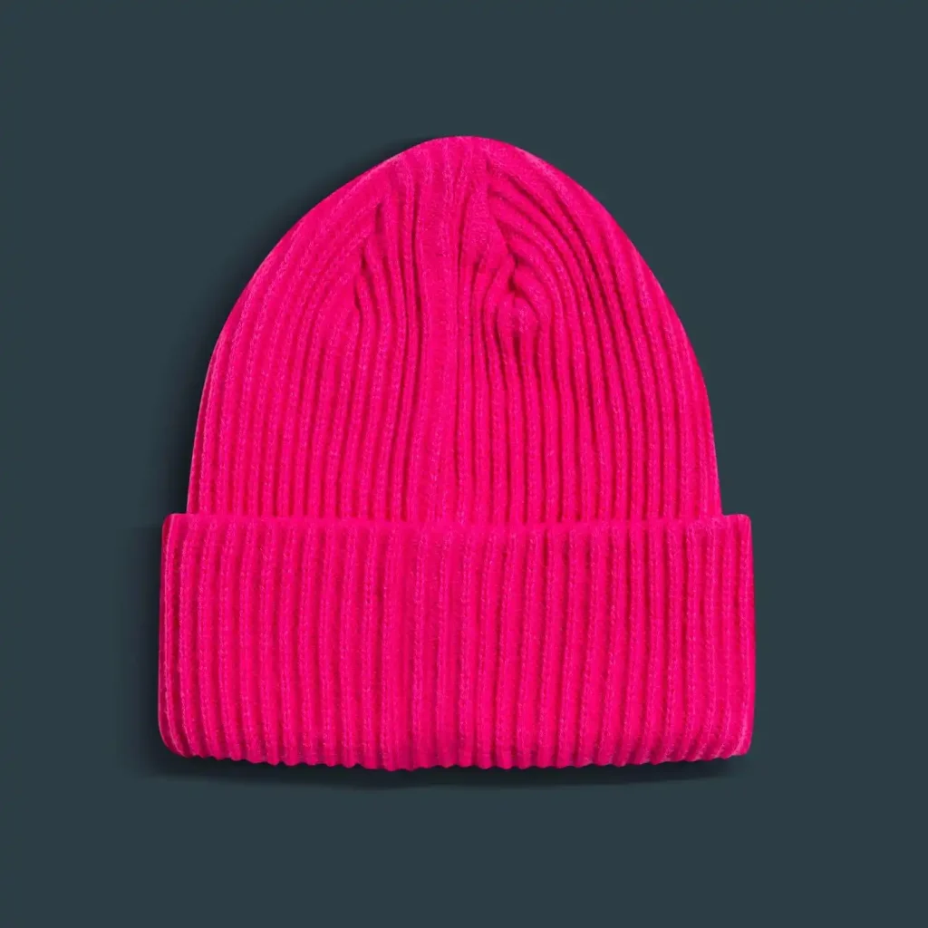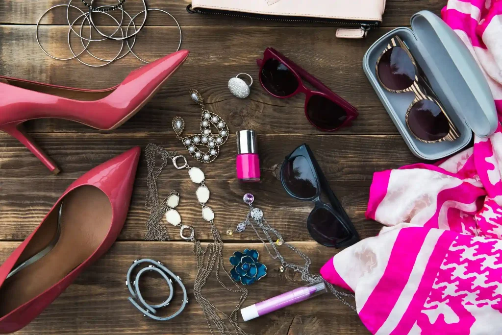
Color is the first thing people notice about an outfit, usually before they even register the clothing itself. Yet most people play it safe, reaching for black, white, and grey every single time because mixing colors feels like a gamble. The truth is that using fashion color combinations well is a skill anyone can learn. It does not require a stylist or years of fashion experience. This article breaks it all down, from basic color theory to skin tone matching to outfit formulas you can use starting today.
Why Color Matters More Than You Think in Fashion
Color does a lot of work before you say a single word. Studies consistently show that people form impressions within seconds of seeing someone, and what you wear, including the colors you choose, plays a significant role in that impression. Warm tones like red, orange, and camel tend to project energy, confidence, and approachability. Cool tones like navy, grey, and forest green signal calm, reliability, and quiet authority. Neither is better. They just communicate different things, and knowing that gives you real power over how you show up. Learning to work with fashion color combinations is not about chasing trends. It is about understanding which colors work consistently for you and using them with intention.
Understanding Basic Color Theory for Everyday Dressing
Color theory sounds like something from an art class, but the basics are genuinely useful when you are standing in front of your wardrobe trying to put an outfit together.
The Color Wheel Simplified
The color wheel organizes colors in a way that shows how they relate to each other. Complementary colors sit directly opposite each other on the wheel, like blue and orange or purple and yellow. These pairings create high contrast and bold looks when done right. Analogous colors sit next to each other, like rust, terracotta, and mustard, and they naturally feel harmonious because they share undertones. Triadic combinations pull three colors evenly spaced around the wheel and work well when one color dominates, and the others appear in smaller doses. You do not need to memorize the wheel.
Warm Tones vs. Cool Tones in Clothing
Every color has a temperature. Reds, oranges, yellows, and warm browns sit on the warm side. Blues, greens, purples, and cool greys sit on the cool side. The reason this matters is that mixing warm and cool tones without awareness is often what makes an outfit feel slightly off, even when the individual pieces are nice. When you build outfits within the same temperature family, they tend to look cohesive automatically. This does not mean you can never mix warm and cool, but doing it on purpose with clear contrast, rather than by accident, produces much better results.
How to Match Colors to Your Skin Tone
Wearing the right colors for your skin tone is one of the fastest ways to look more put-together without changing anything else about your style.
Finding Your Undertone
Your undertone is the subtle hue beneath your skin’s surface, and it stays consistent regardless of how tan or pale you are at any given time. A simple way to check: look at the veins on the inside of your wrist. Bluish or purple veins suggest cool undertones. Greenish veins suggest warm undertones. If you see both, you likely have neutral undertones. Another test is to hold a piece of bright white fabric and a piece of cream fabric near your face. If white looks better, you are likely cool-toned. If cream looks better, you are probably warm-toned.
Best Color Palettes by Skin Tone
Fair skin with cool undertones tends to look best in jewel tones, deep blues, and soft pinks rather than yellows or oranges, which can wash it out. Medium skin tones are versatile and can carry both warm, earthy shades and cool jewel tones well. Olive skin looks particularly strong in warm greens, burnt orange, gold, and rich browns. Deep skin tones are stunning in bold, saturated colors like cobalt blue, emerald, fuchsia, and bright white. These are starting points, not restrictions. The goal is to find the shades that make your complexion look alive rather than flat.
The Most Wearable Fashion Color Combination Formulas
The Neutral Plus One Rule
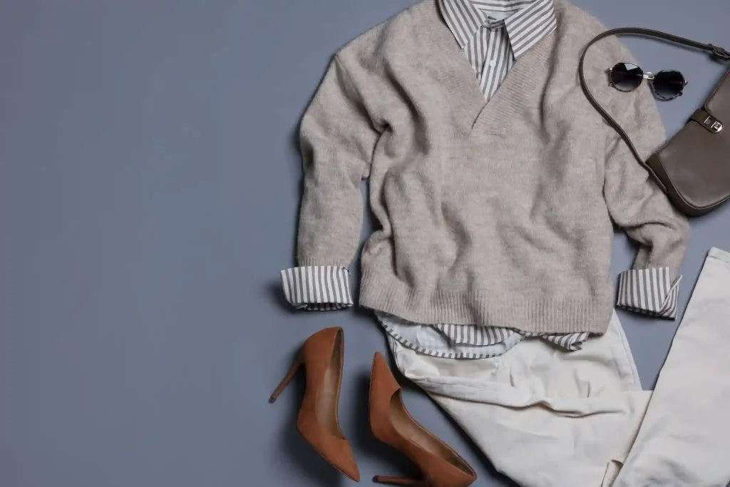
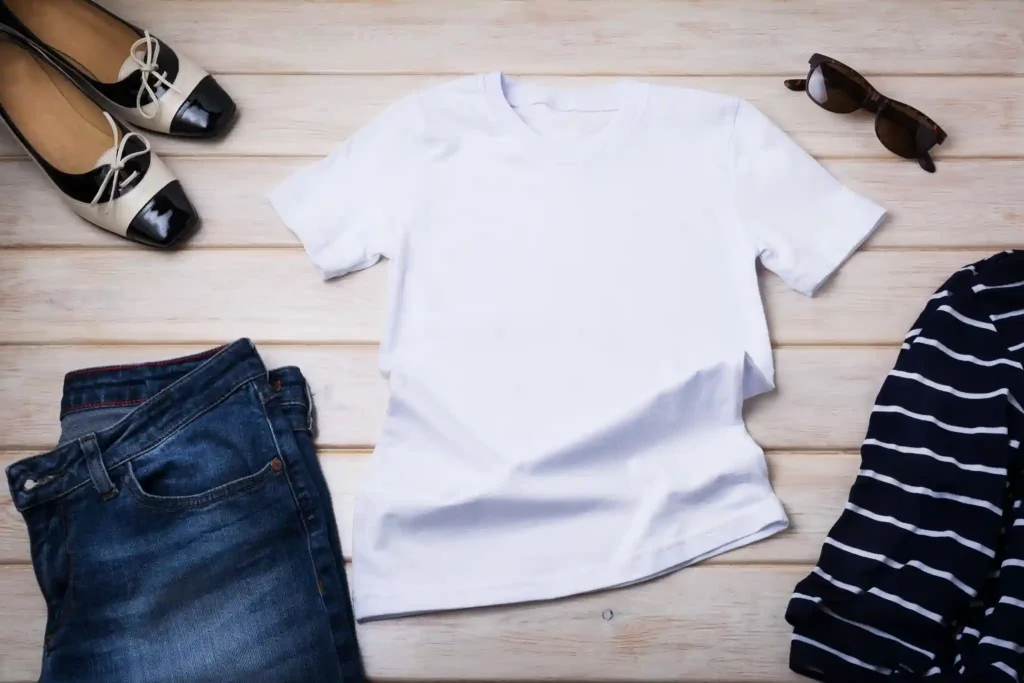
This is the most reliable formula in fashion. Pair one neutral, which could be black, white, beige, camel, grey, or navy, with one color, and let the rest of the outfit stay simple. A camel trench coat over a white shirt with straight-leg blue jeans is a perfect example. The color does the talking, and the neutrals let it breathe.
Tonal Dressing Done Right
Tonal dressing means wearing different shades of the same color family in one outfit. Think a light blue shirt with medium wash jeans and a navy jacket, or ivory trousers with a cream blouse and a tan belt. It looks polished and expensive because it shows intention without trying too hard. The key to making it work is varying the textures in your fabrics so the outfit has visual interest. A flat, same-texture tonal outfit can look dull.
Complementary Color Pairing for Bold Looks
Complementary pairings use colors from opposite sides of the color wheel, and they work because the contrast makes each color look more vivid. Rust and cobalt blue are a classic combination that feels both modern and grounded. Burgundy and forest greenares rich and work especially well in autumn. Mustard and deep purple sounds unusual until you see it styled well and realize how striking it is.
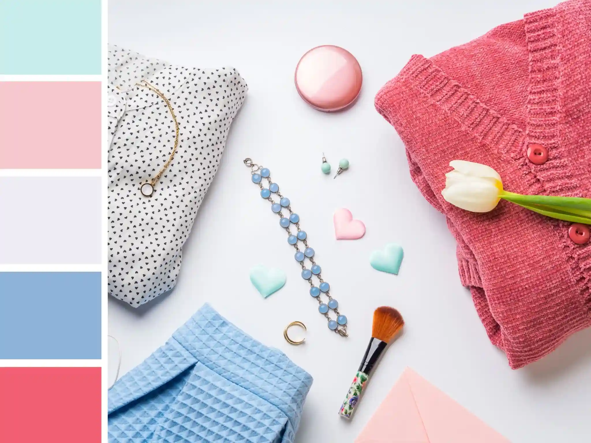
Building a Color-Confident Wardrobe From Scratch
The smartest way to build a wardrobe around color is to start with a solid neutral foundation and then add a small set of accent colors that work well together and suit your skin tone. This is sometimes called a personal color palette. When your wardrobe revolves around three or four consistent accent colors alongside your neutrals, everything mixes and matches easily. Getting dressed takes less time, you make fewer impulse purchases that never get worn, and your overall style looks more consistent.
Seasonal Color Dressing and When to Break the Rules
Different seasons naturally inspire different color moods. Autumn tends toward warm, earthy tones like burnt orange, olive, and chocolate brown. Winter suits deep, rich shades like burgundy, forest green, and midnight navy. Spring feels right with soft pastels and warm whites. Summer calls for bright, clean colors and bold contrasts. These seasonal tendencies exist because the light, landscape, and general atmosphere of each season make certain colors feel fitting.
Common Color Combination Mistakes and How to Fix Them
Wearing Too Many Colors at Once
The most common mistake people make with color is using too many at once. When an outfit contains four or five different colors, the eye does not know where to look, and the overall effect feels busy rather than bold. A simple guideline to follow is the three-color rule: one dominant color, one secondary color, and one accent. Keeping that balance makes even adventurous fashion color combinations feel controlled and considered rather than chaotic.
Ignoring the Role of Prints and Patterns
Prints already contain multiple colors, which means they need to be treated like a color block when you are building an outfit around them. The easiest way to do this is to pick one color from the print and repeat it elsewhere in the outfit.
Conclusion
Getting comfortable with fashion color combinations does not happen overnight, but it does not have to be complicated either. Start with the basics, know your undertone, learn a couple of reliable formulas, and build a wardrobe around colors that genuinely suit you. Color is one of the most expressive tools you have when it comes to personal style, and using it well makes a real difference in how you look and feel. Pick one new combination from this article and try it this week. Confidence with color always comes from doing, not just reading about it.
Frequently Asked Questions
Q1. What are the best fashion color combinations for beginners who are new to styling?
Start with the neutral plus one rule. Pair a neutral base like white, black, or beige with a single color. It is simple, reliable, and works for almost every outfit and occasion.
Q2. How do fashion color combinations differ based on skin tone and undertone?
Cool undertones suit jewel tones and deep blues. Warm undertones look best in earthy shades and warm neutrals. Neutral undertones can carry both. Knowing your undertone helps you choose colors that make your complexion look vibrant.
Q3. Can I mix warm and cool tones in one outfit using fashion color combinations?
Yes, but do it intentionally. High contrast pairings, like a warm camel coat with a cool blue outfit, can look striking when one tone dominates, and the other plays a supporting role throughout the outfit.